
GRAIL - Internal Tools
March 2019 - may 2020
Grail's core product is a liquid biopsy multi-cancer diagnosis test that can detect 20+ types of cancer. The bioinformatics pipeline was trained by vast amounts of tumor genome data obtained through high-intensity sequencing from large population studies. Grail has built various internal tools to facilitate these studies and make work more efficient, a few specific tools that I work on are:
EDC (Electronic Data Capture) - Used to track patient data, outcome, and status in various studies.
LIMS (Laboratory Information Management System) - Manage samples that go through various steps in the clinical lab before entering the bioinformatic pipeline.
Automation - Centralized management for in-lab automation processes.
Data Visualization - Tool for monitor samples statistics, view lab progresses, and analyze various metrics.
Pre/Post - Management tool to process inbound of samples and outbound of results.
My Role
I'm the first (and only) product designer at Grail. I work with 20+ engineers on various teams to update the common UI library and design new features to accommodate specific needs.
The following are few examples of design challenges I worked on.
Complex Filter
Challenge
Our data-viz tool allows us to see relationships and outliers with set parameters. As our data increases in volume and becomes more complex, we need a more advanced way of filtering through the copious amount of information. Engineers have been writing queries in R and importing the result into a different tool to generate the graphs needed -how do we build an interface inside data-viz that supports the same query-building for users without coding knowledge? This was important to do easily since we didn’t want this to become a bottleneck for people accessing information.
Research
The first step is to understand why (and what) queries are needed by talking to the end-users. Lab monitors gave me a scenario that they might encounter:
In natural language
“I need to see all v0.5 CCGA2 samples regardless of the tag (since CCGA2 samples don't have tags) and v1 AV only (not Clin E2E).”
What this looks like in code
filter((assay_id == "TM_CFDNA_CLINICAL" & grepl("CCGA2", edc_reservation_labels)) | (assay_id == "TM_CFDNA_V1_CLINICAL" & grepl("AV", sample_tags) & !grepl("ClinE2E", sample_tags)))
General representation of RStudio. Not of actual Grail data.
How engineers think about this

Design
Two engineers and I sat down for a brainstorm session on how we might design this complex filter interface. We started with how engineers think about the backend by building a tree structure. The problem with this design is that most users don’t think of their query in a linear and structured way, and the build-a-tree configuration introduces more complexity in both code and graphical interface.
I drew a lot of inspiration from other complex formula tools and tried to simplify the design to a simple set of parameters that could combine in interesting ways. I iterated on this a few times and ended up with something the users said they unexpectedly loved - it was great to see engineers who didn’t think this way really come around and appreciate what design did for their workflow.


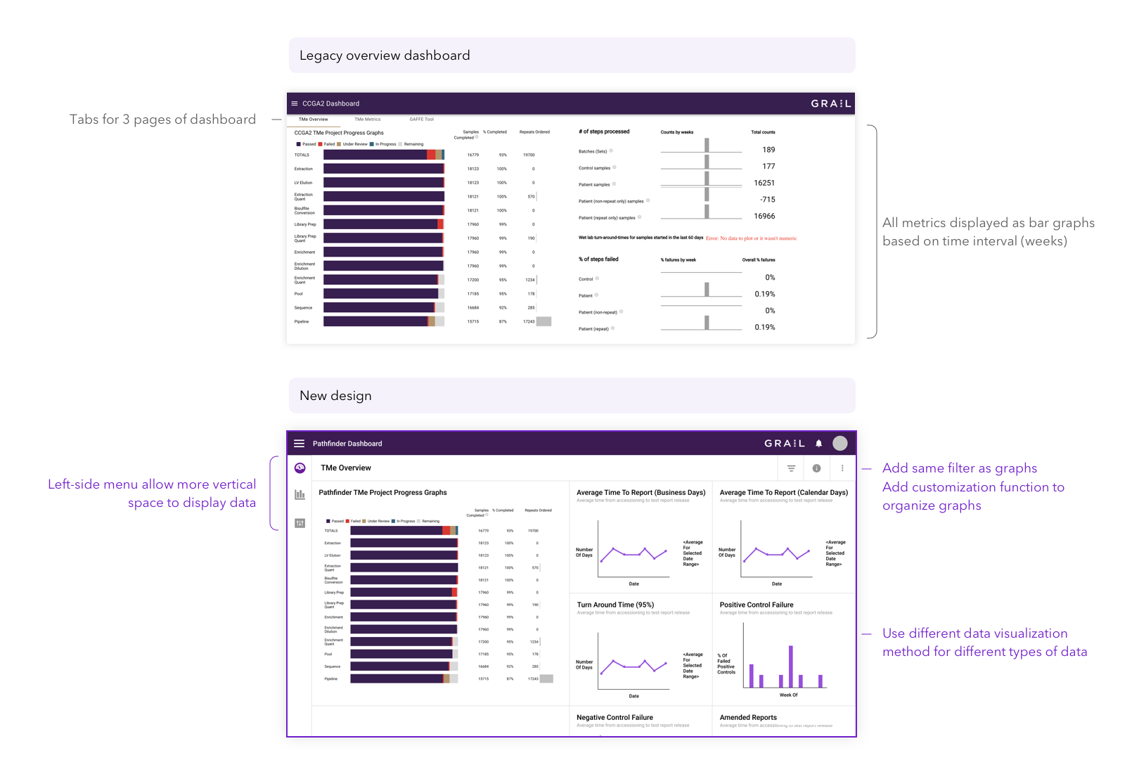
Data Visualization Dashboard
Challenge
We’re delivering results for the first time with the launch of Pathfinder study -to accommodate requests from various parts of the business, we decided to do a design overhaul of the data-viz dashboard. Functions in data-viz were added incrementally and new features were crammed into any space that allowed it. My challenge is to organize features and streamline the UI for existing functions and provide a systematic design that scales for future use.
Research & Design
The individual data plot/chart/graph is largely not impacted in this design change as I focused on the overall framework. First I analyzed the problem areas that exist in the current layout by talking to end-users, then found out why they’re in such a way by asking developers. Second, I made mock-ups for the pages in response to what I found and walked through the design with stakeholders. Lastly, I incorporated the feedback and shipped the first version of the design to my dev team for production.
Overall, this was a challenge in thinking about design frameworks and building an interface that would last and scale to different tools we’d want to add in the future.


Automation UI Redesign
Challenge
Skynet (our automation software) is a system that manages the execution of instructional sequences in performing lab-operations. Skynet has a web-based UI that provides centralized management of all automation processes. The UI allows Skynet programs to be initiated centrally, resources/instruments to be reserved centrally, and errors to be reported centrally.
One very specific challenge we faced is that Chromebooks used in the lab have a small screen, and the header bars squish process monitor tightly. How can we accommodate the new features added while maximizing workspace for automation timeline & instructions?
Design
I did a lot of navigation design to best accommodate small screens as well as back/forth navigation, which was the most common in these workflows.
Challenge
Another specific problem for Skynet is that given the new layout of the processing timeline (designed by the PM before I joined), how can we add updates to improve the connection between timeline and step details?
Design
I analyzed current designs and asked users about their pain points. I then incorporated feedback I got with good UX practice to make UI improvements.
