
Retail Innovation - Fitting Room App
2017 | Status: launched
To stay relevant in the fast changing retail ecosystem, brands must embrace change. As a part of AE’s digital transformation effort, a small team of PMs, researchers, and designers came together to form a retail innovation team. As part of this team, we thought of ideas and tested them in our lab store with the goal of eventually bringing these concepts worldwide.
Involvement:
Research
Product Design
Prototyping & User Testing
Opportunity
One of our focuses was bridging the gap between the digital online shopping experience and the physical in-store experience. As a % sales, AE saw a decrease in physical store sales while online sales were seeing a spike, so we wanted to see if we could bring the benefits of online experience to the store while still highlighting the advantages of in person shopping. We came up with ideas that made the in-store journey more experiential and transformed the space into an interactive, open and inviting community.
To paint a better picture of this team, I’ve included a couple of concepts we worked on in the lab store:

Maker’s station customizing one-of-a-kind apparels.

Laundry machine for customers (and students nearby) to use and hangout.

Open space to sit and relax, also can adjust to host events.

Patches at the maker’s station.

Commercial grade washer & dryers.

Good view of the city, free wifi, and interactive space.
Research
Aside from the store’s space itself, we also saw an opportunity to improve customers in-store shopping journey. We found that for intentional shoppers, the reason they prefer in-store shopping vs online was to feel and try on the products prior to purchase. We wondered if we could improve a customer’s try-on experience through digital means.
We surveyed and shadowed customers and found that for repeat shoppers with the general feel of fit and style, an illustrative guide for items like jeans and bras is enough for them to purchase without trying on the product. We designed video fit guide installed by our jeans so customers can see what the fit is like without trying it on. We also proposed shooting the footage with various sized models to show different size fits.

Jean wall with fit guide

Video fit guide of jeans.
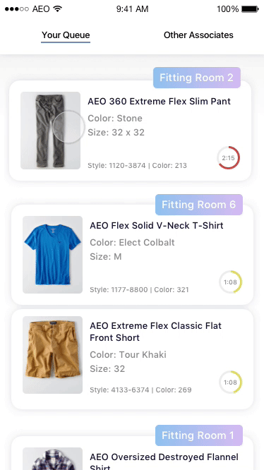
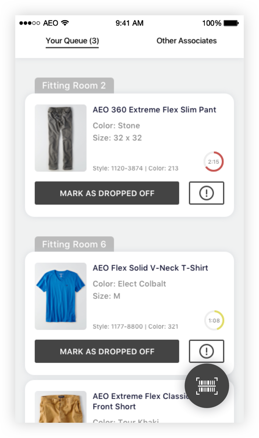
We also found that #1 complaint when it comes to the in store experience had to do with fitting rooms. The doors are locked and an associate must be flagged down to get a room or to get new pieces of clothing - it was such a hassle that it often led to lost sales. To solve this we simply proposed removing the doors and replace them with curtains, which gave the customer free and fast access to the fitting rooms but also gave us a new challenge: security.
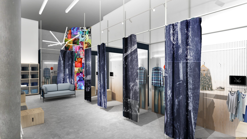
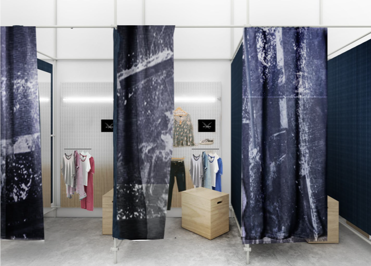
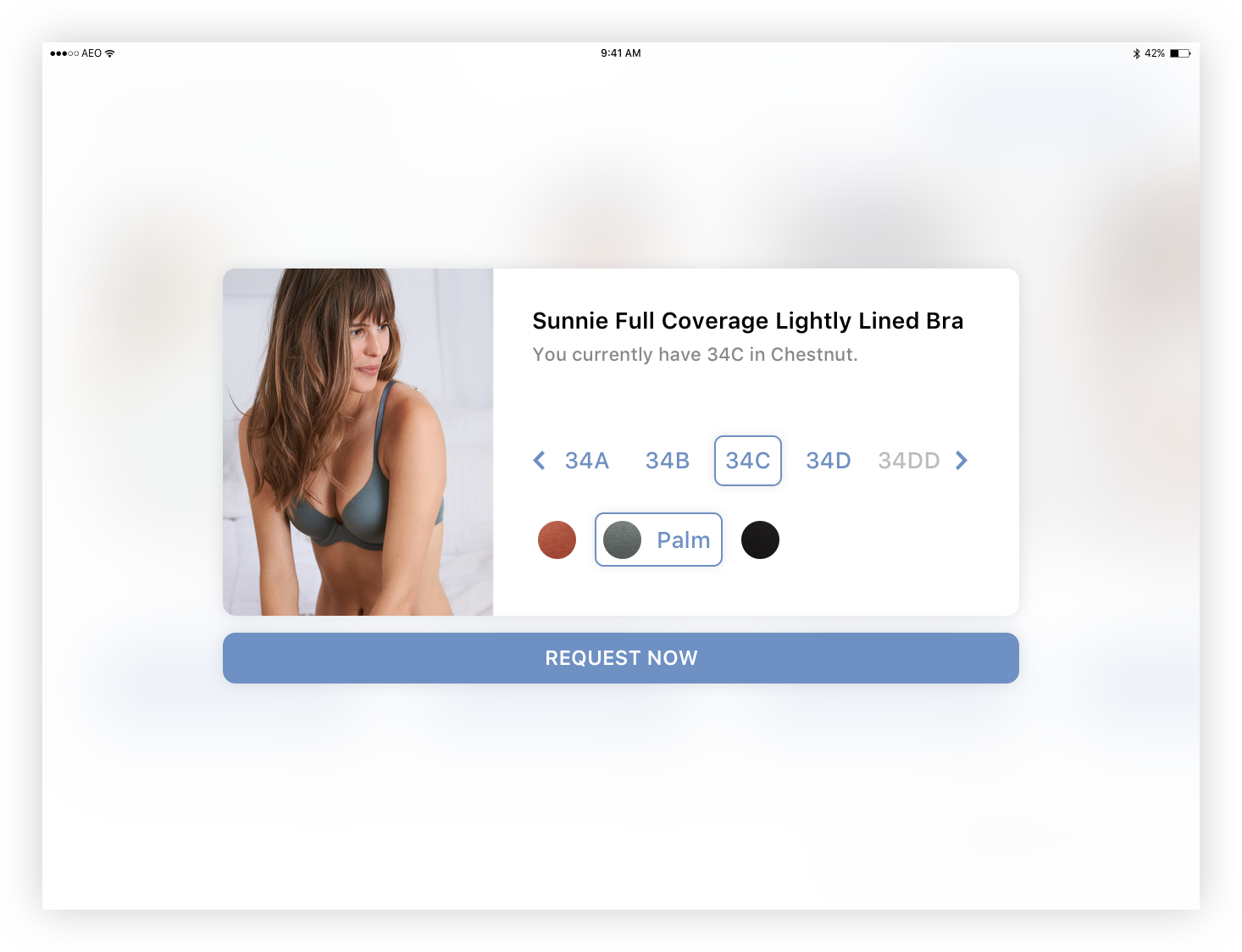
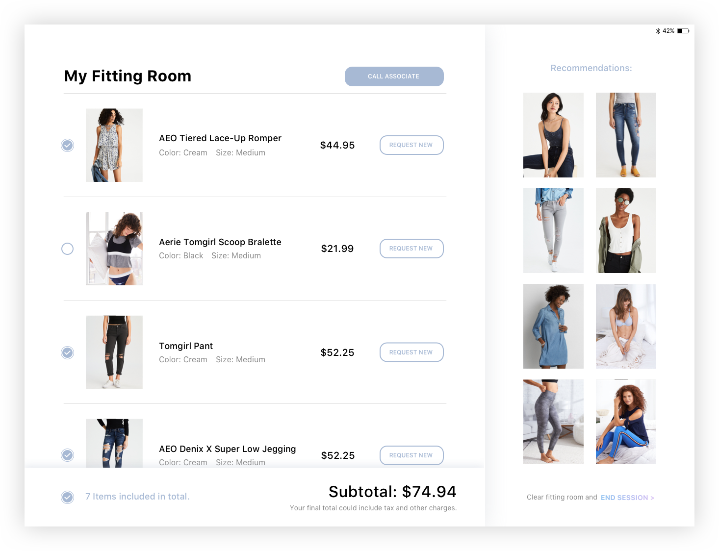
After making these two changes, we observed from our customers that getting a new size or color when something wasn’t to their liking was difficult. If they were alone and something didn’t fit, the customer was more likely to give up on the item to avoid the hassle of another try-on trip. We saw an opportunity to introduce technology into the fitting rooms to improve the experience, which was the focus of this product.
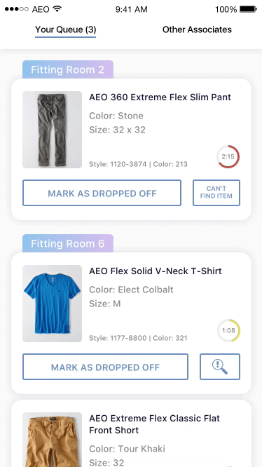
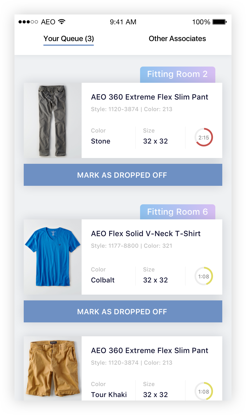
The fitting room product will require two applications: one for the customer, one for the store associate. The user and their needs / problems / goals are quite different. We put most effort into customer side research and development since we can always train the associates and get feedback after MVP launch.
Wireframe
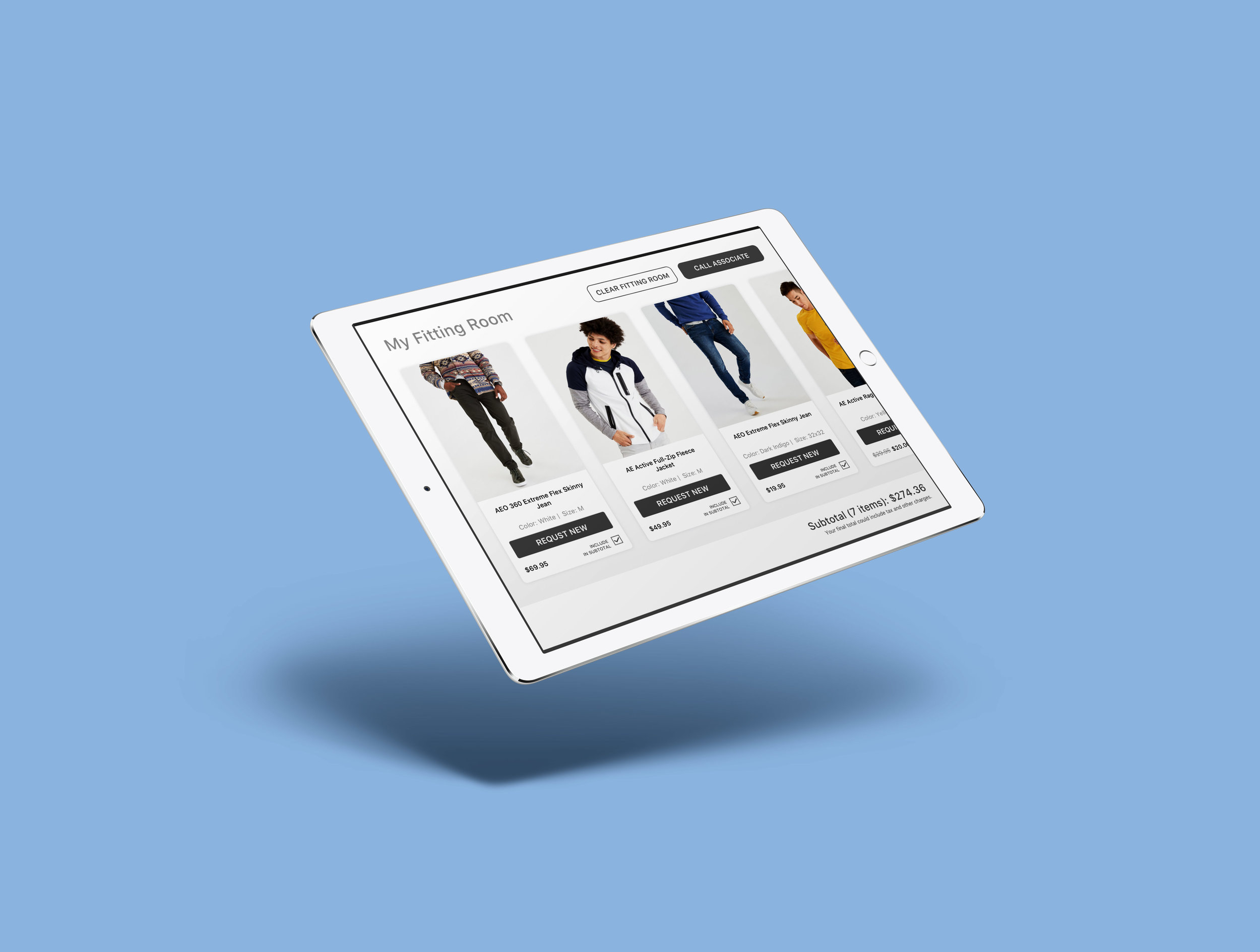
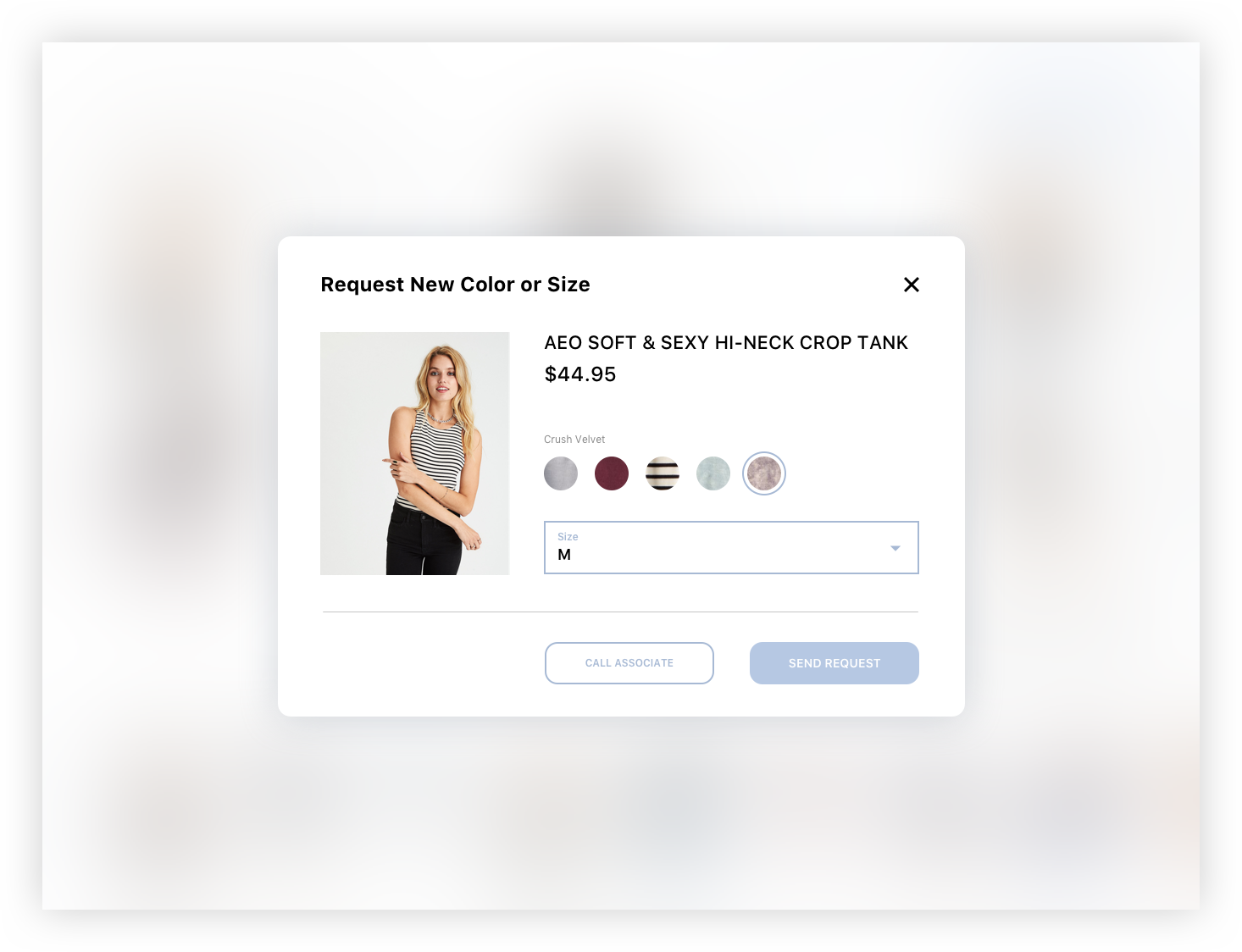
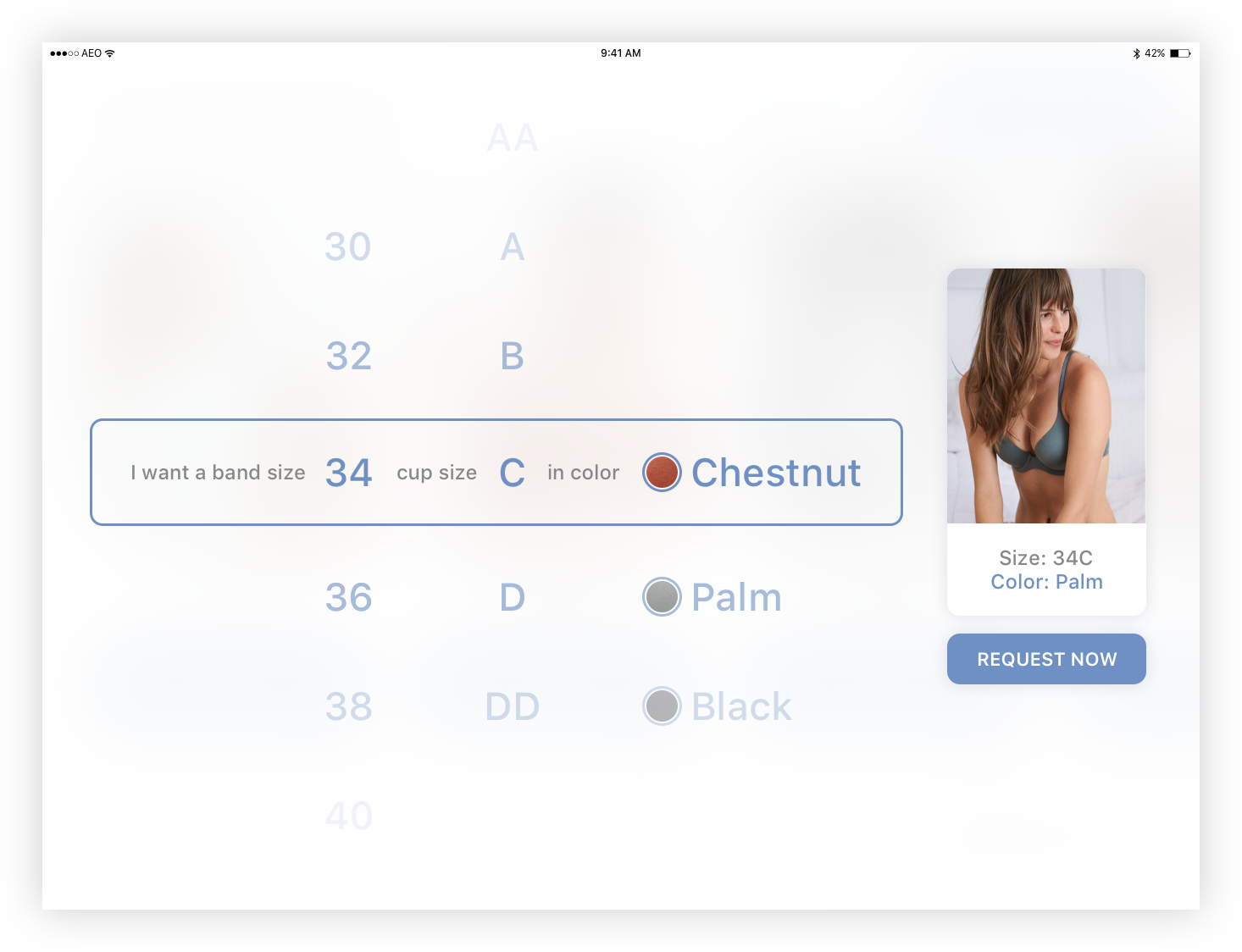
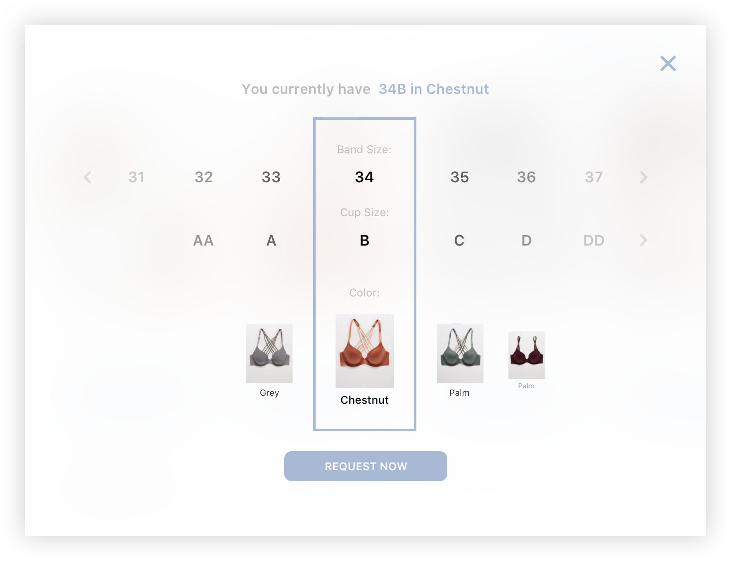
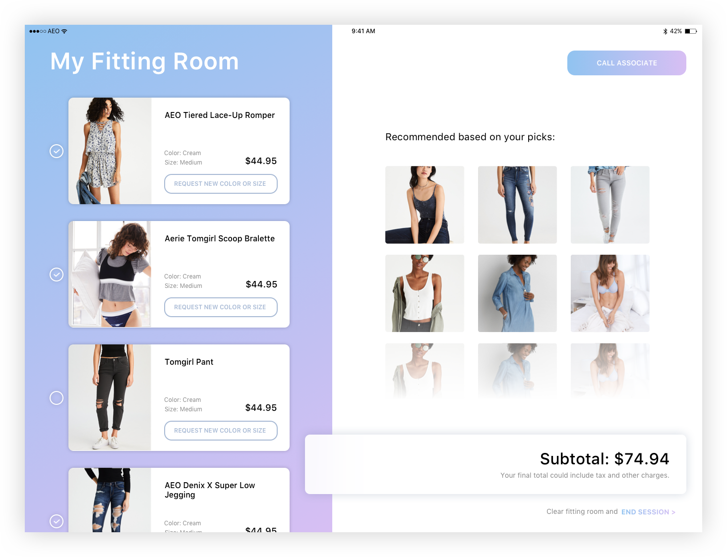
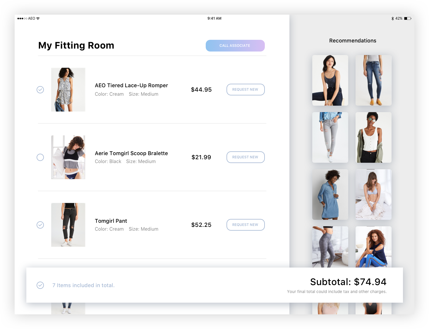
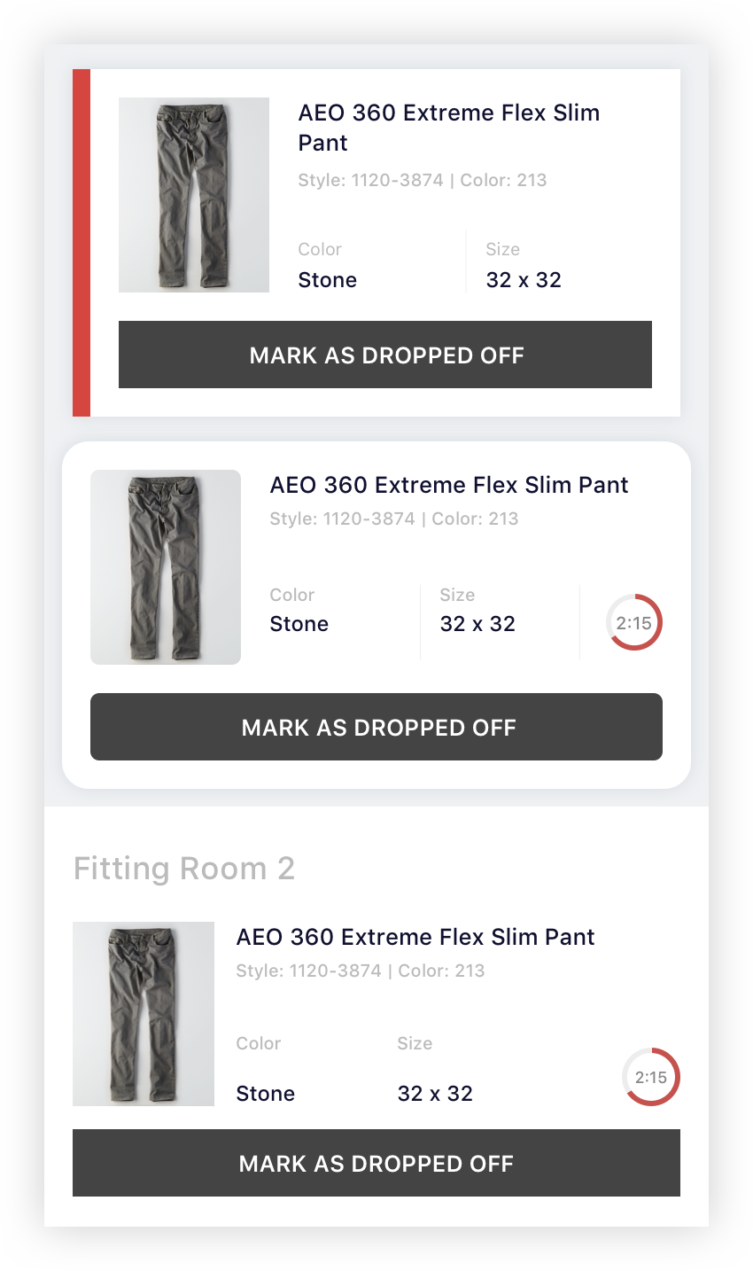
The basic functions are very simple based on our research. A user must be able to request a new color or size from the styles they’ve taken into the fitting room, and they must be able to request assistance from an associate should they need it. We played around with adding in inspirational pieces or content but ultimately decided to remove it from MVP. Before we can implement a fully “magical“ and automated product detection system in our fitting room, we decided to rely on store associates to scan in the pieces when setting up the fitting room. We also later added on budgeting functionality because promotions in our store could be confusing and our shoppers tends to have a budget in mind.

Main screen wireframe.

Request selection screen wireframe.

Associate side wireframe.
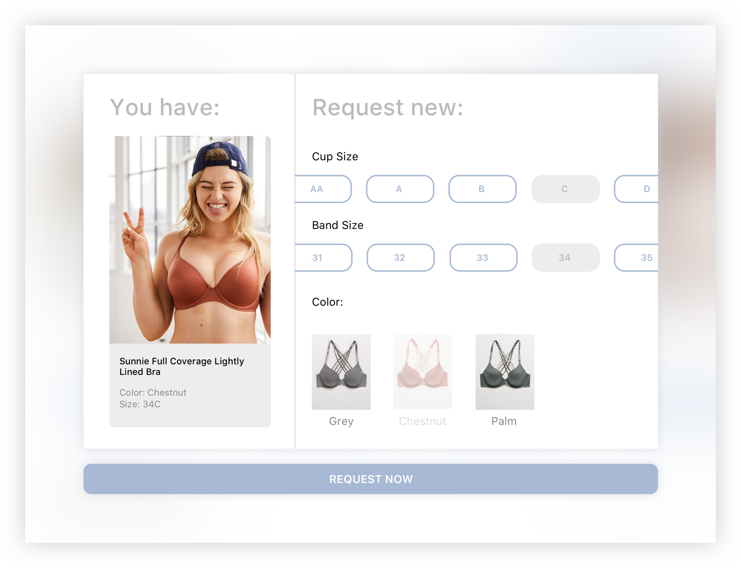
Design Iterations
Customer side app
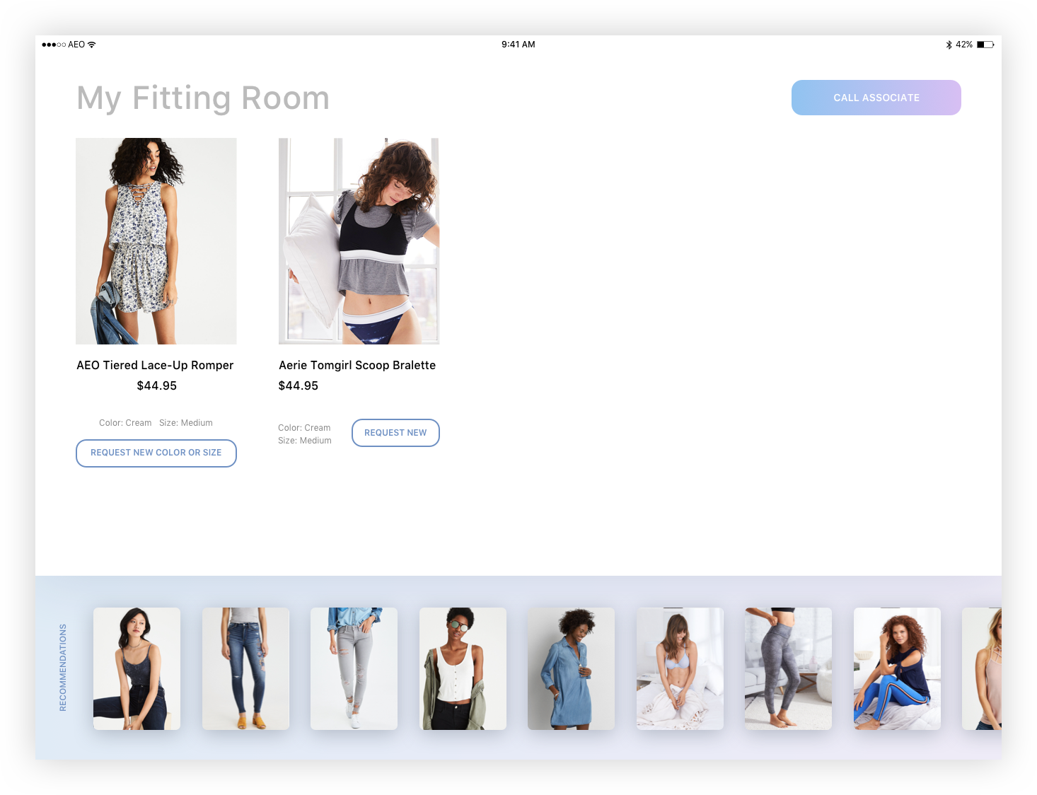
This experience would be among the first of its kind. Without any best practice guidance, I have no choice but to iterate and test often with real users. The most important thing is usability - a user must know what this is for and how to use it upon seeing it for the first place. We cannot rely on associates to teach them how to use it - if it’s not intuitive enough, it won’t be used.
There are two critical experiences (or screens) to design - home screen (where user can browse what they have in the fitting room), and request screen (where user can notify store associate if they need something).
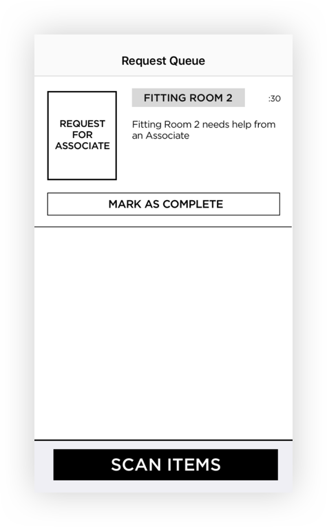
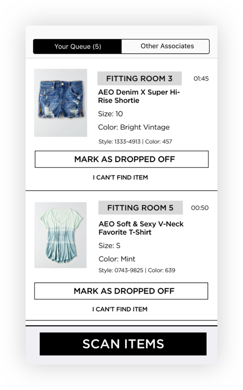
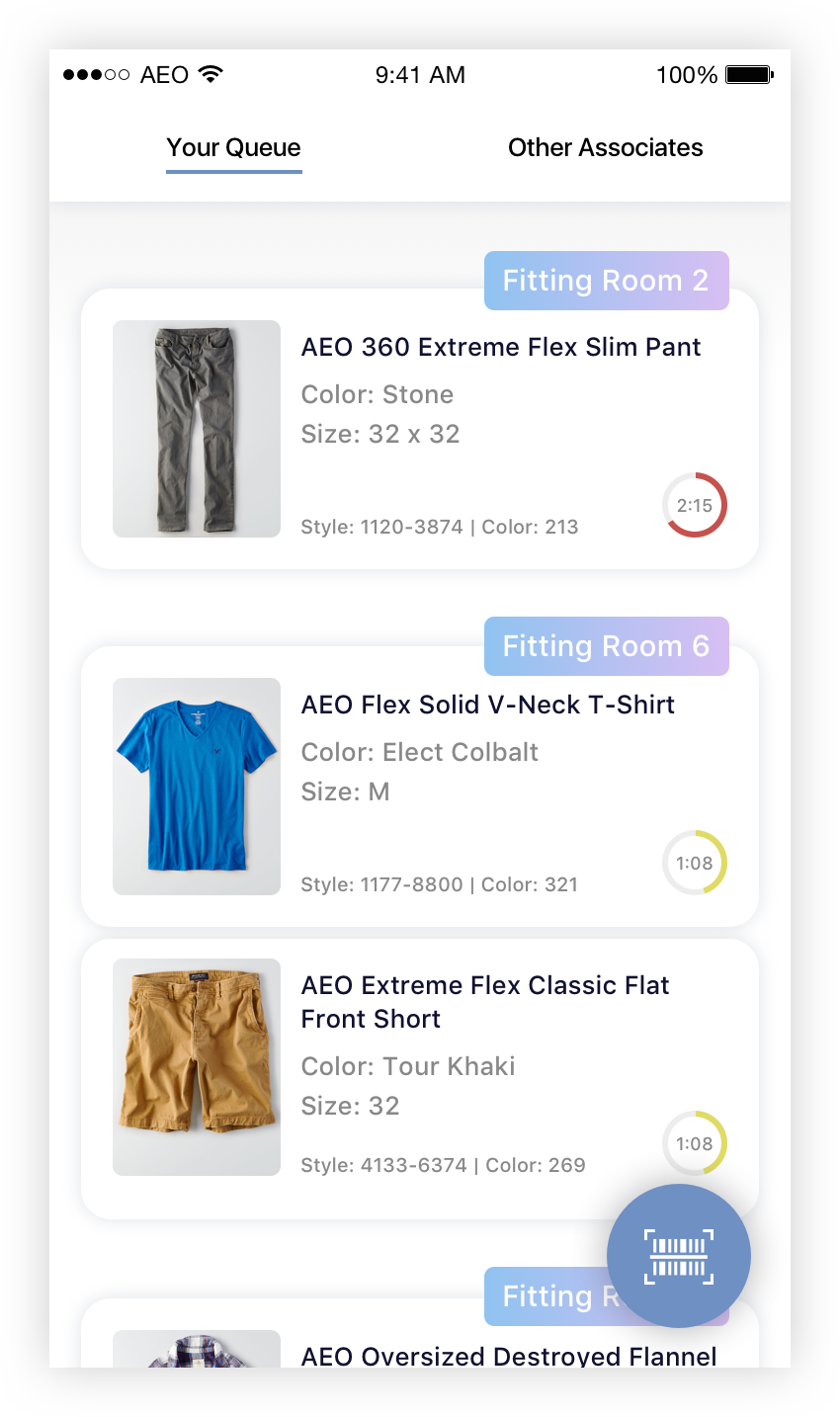
Associate side app
The main purpose of the associate side app is to receive requests from the customers in the fitting room and bring the requested items in a timely manner. Before we can support “magic“ sync via RFID tags we would also need a way for associates to physically set up a fitting room by scanning in individual products. I built interactive prototypes at this stage so we can test with associates.
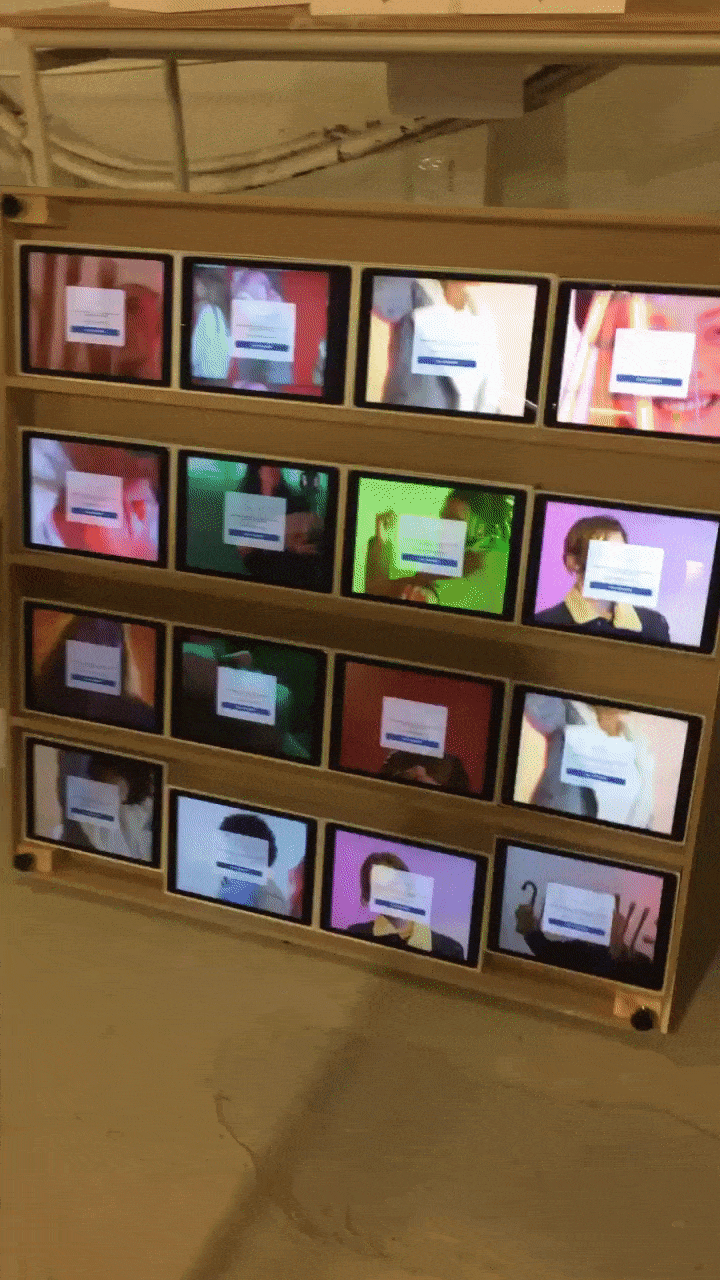
Testing
Each time I made a UI or UX change, I went around the office and tested with someone that’s unfamiliar with the project. With each major iteration, we went to our physical stores to test with real customers. We gathered much valuable feedback about their thoughts and how we can best optimize the features; we kept iterating until we’ve reached something users understood and liked.


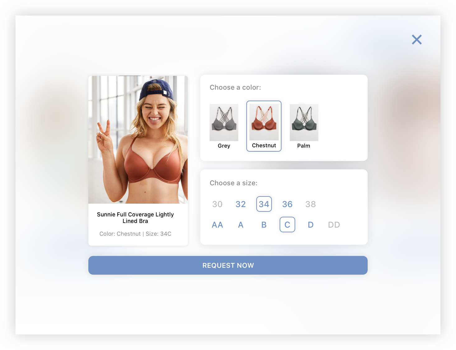
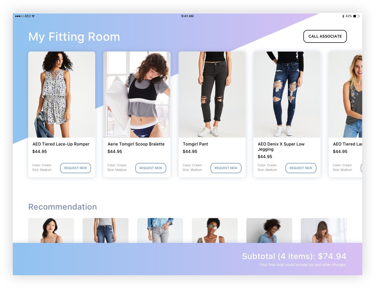
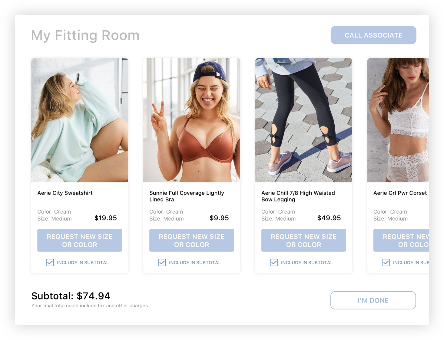
Final Product
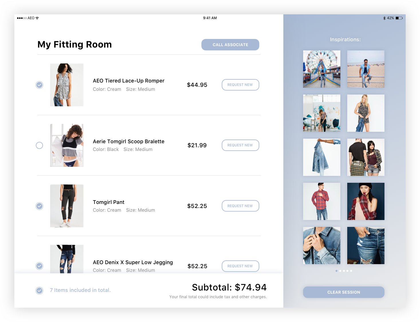
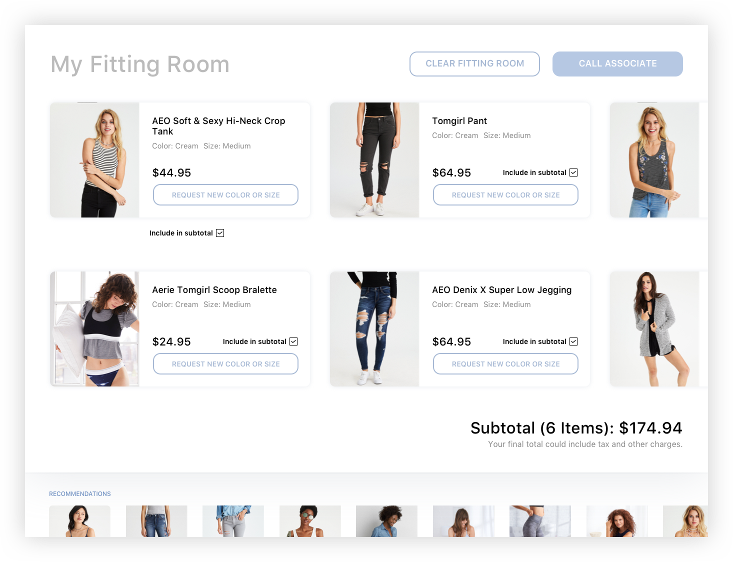
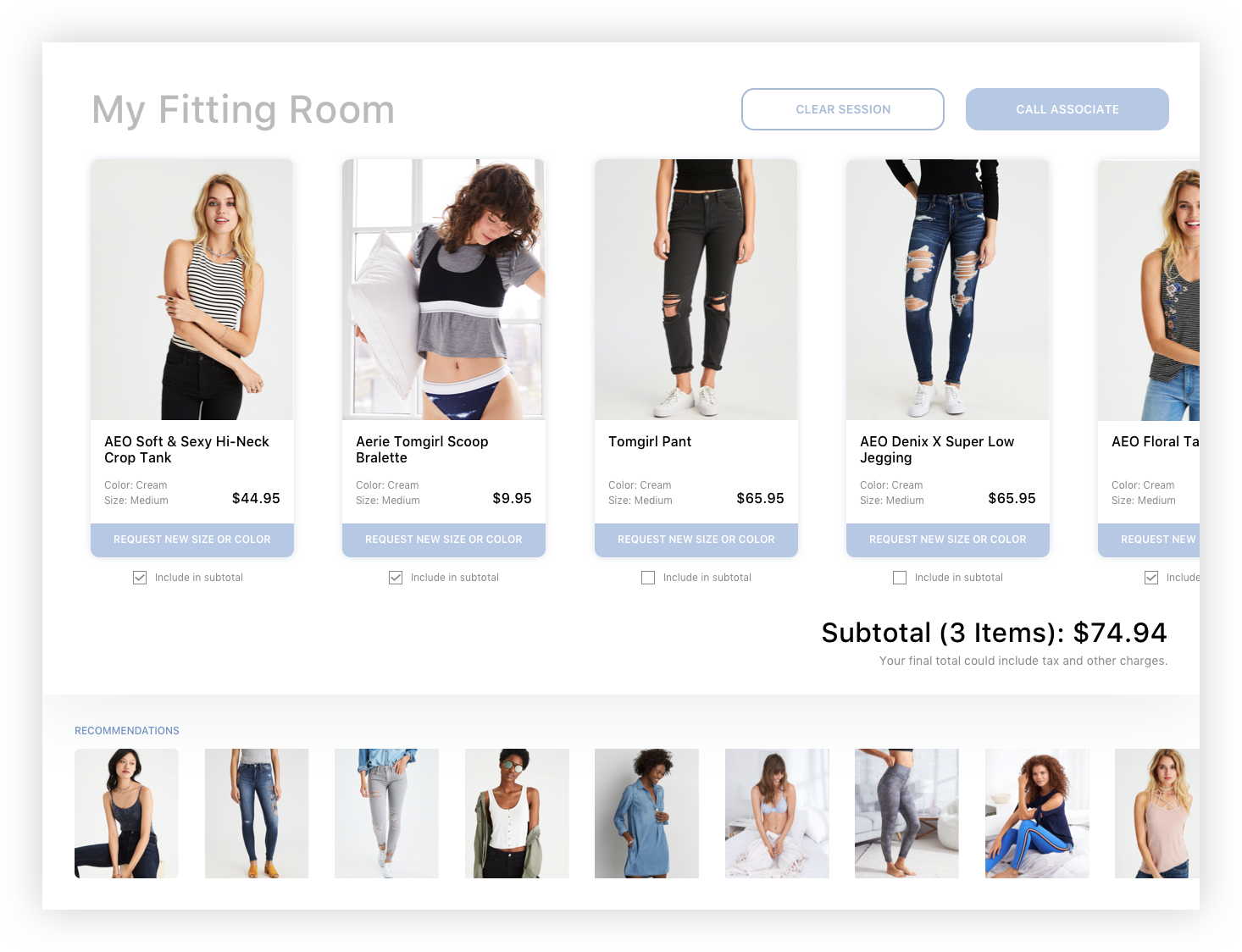
After many rounds of testing and iterations, we’ve designed the interface for MVP launch in our test store. We spent more time making sure the consumer side app is easily usable and understandable, while on the associate side we focused on speed as we have more accessibility to train them.
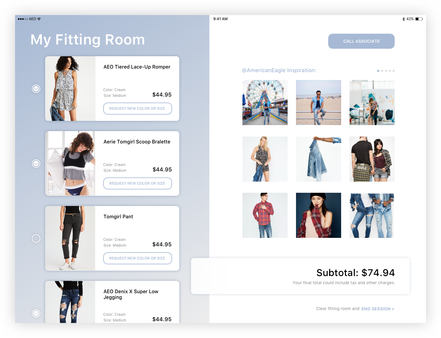
For launch, I also replaced the waiting screen with the seasonal campaign so even when the device is not used, it serves as a brand touchpoint.
Final Associate Flow
Final user flow

As a finishing touch, I layered in the seasonal promotional video as the background of the application when not used. It serves as inspiration and tie in with the brand message nicely in the fitting room.
Result
I left the company not long after shipping the first version of this experience, so I’m not sure how the product performed. However, the metrics we tracked were how often the screen is used, how often new sizes and colors were requested, and if that led to a successful purchase. We also tracked how long it took associates to get the clothing, and how long customers spent in the fitting room with vs without the device. Since we launched this in our lab store in NYC, we tracked all of this from customers physically in our store.
The biggest pain point prior to launching was the need to have associate scan in items before try-on. To remove this barrier, AEO later partnered with startup aila to add a scanner on the display so customers can add their own products at will. The technology has been show cased at NRF in 2019 (in the press: AEO Showcases Smart Shopping Experience).
